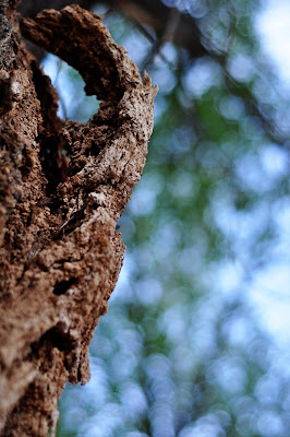
 nikon d90, f2.5, 1/160, iso400, 50mm, exposure bias -1.0, no flash
Saturday, May 16, 2009
Rough Bark
 nikon d90, f2.5, 1/160, iso400, 50mm, exposure bias -1.0, no flash
Rough coat
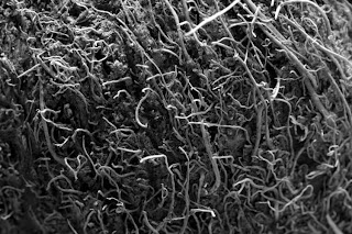
This looks like an image out of a scientific paper to me, which is probably why I find it appealing. It's a coconut shell I had hanging around, holding change (and other odds and ends). Taken in natural light with a 50 mm macro; ISO 100, f/8.0, 4 sec exposure. Changed to bw and boosted the contrast. cc
I'm very happy to actually be participating this time. I took a bunch of pictures for the fluid challenge only to discover I couldn't download the images. The problem's fixed now (obviously) but too late (grr). Anyway, I wanted to share the pictures I took, which can be seen here along with some other pictures I took for this challenge.
Rough on the Road
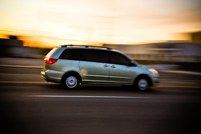 I didn't have anything specific in mind when I randomly selected this word--and I had to really think HARD about it! I came up with a few other ideas, but at the end of the day, the one that kept coming to me was the rough road trip we just finished! While it was a good trip, it was also ROUGH to keep the kids in carseats and to get some real REST while driving! :)
I took this tonight on a busy street (and I am shocked nobody called the police on me because they all probably thought I was stalking them) Took lots and lots of shots...and in the end I am frustrated because I kept the ISO too high--so it's granier than I would like.
ISO 800, 30 mm, f20, 1/13 second
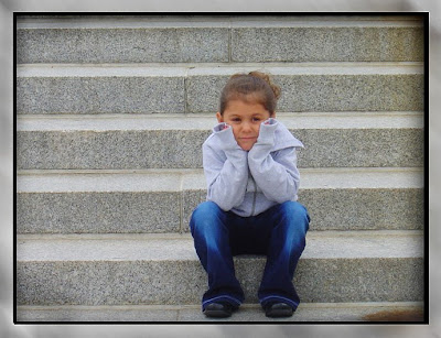
Some had it Rough
My husband and I were out taking a drive today and came across this little town that had all these really neat historical things like, wagon wheels, wagons, tractors, and many old pioneerish type things. So I choose this wagon as my picture of the day because we all know how the Rough the pioneers had coming across the plaines, I never would have made it! We owe so much to them and I am eternally grateful for all they went thru for us.
Winners: FLUID
Drum roll please....
First place goes to Shelby for her oh so awesome "Droplets" shot.
Second place was tied for Teri with her majestic shot of "Fluid in Motion" and Melanie with her "Fluid, both definitions".
Way to go ladies...YOU ROCK!
Everyone did a super job with this one...it was fun seeing all of the different ways FLUID could be interpreted!
Have a great weekend!
Friday, May 15, 2009
POPPING IN!
I am sorry I haven't been around for a few days. We were on the road and didn't have internet access--but we are finally in Idaho! hooray!
I am sorry some weird things have been going on! :) I notices the preposting didn't work so well, and that we dont' have winners announced, and that we haven't posted the feature photographer yet. I have a lot to get on top of for sure! So, I apologize for being out of the loop.
Anyway, I will be back again tomorrow with a challenge...and will get the feature photographer posted today.
I loved all your photos! WOW! What a great last challenge!! Am bummed I missed it!
Oh, one more thing. I did some thinking about the voting and wondered something. I really want everyone to feel included, and like they are progressing! I know a lot of you have felt like you won't ever make the cut and win a challenge. I wish there were some perfect way to make it all good for everyone. I know we started out with the best overall and best take, and that seemed to just get the best 2 overall pictures...so we changed it and picked a selected random category and best overall...which I still felt ended up being lopsided sometimes.
I guess I wasn't really sure what to do this time, so I just went for the best overall...
I am pretty sure this voting thing is going to drive me crazy until i figure out a great way to make it good for everyone...
sigh...
:)
Anyway, happy Friday!
Featured Photographer...Melanie

What is your favorite photography subject? (or, what do you like to take pictures of the best?)
Funny question! 2 months ago I think I would have said my kids, although I would love love LOVE to take pictures of anyone’s kids…or anyone for that matter. But now (after forcing myself to become creative for this blog) I get all giddy anytime I get to shoot ANYTHING! Sometimes I can't even sleep because I'm too busy thinking of what I can shoot next!
What camera equipment is on your wish list?
I'm not savy at all on the "equipment" available. I would be thankful to get any accessory compatable with my Nikon. I would love a home photography studio, with additional lighting and backdrop. Additional lenses would of course be nice too!
What are your hobbies outside of photography?
I love to do anything crafty, but I am particularly fond of scrapbooking. I also LOVE to read.
Tell us about your family! (married? Kids?)
I have been married for nearly 11 years to Elmo. We have 4 kids, my stepson Erik is 17, my oldest daughter Paige is 9, my son Coleton is 7, and my sweet baby girl, Jadyn, is 2. I am the 2nd oldest of 6 kids, was born in Utah, and grew up pretty much all over the USA.
Where do you live? (you don’t have to be specific if you don’t feel comfortable)
I live in Litchfield Park, AZ, which is about 20 minutes outside the city of Phoenix.
Do you have a blog you would like to share? (family blog or photography blog?)
I have a family blog and a "photography" blog that I post in regularly. (click on links if you want to visit them)
What is the best photography advice you have ever received?
Would you believe that until joining this blog, I had never received any advice!? Since then, I have been advised by all of you to take shots at various angles, fill the frame, and challenge myself by adjusting my settings and getting to know my camera.
What (if any) editing program do you use?
I use photoshop 7.0, and anything I do to edit my pictures, I have to YOUTUBE first to get a tutorial, since I don’t know how to use it very well.
10.Can you share your favorite 3 pictures with us??
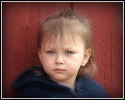
Only 3?!?! Talk about a tough choice! Here are favorites of each of my kids. Enjoy!

Thursday, May 14, 2009
Let it FLY!
I attended my brother's State Track Meet. He threw discus, and I am very proud of him. He has to have a very FLUID motion to get the furthest possible throw.
I didn't get my F/stop high enough, but he only had 3 throws so I wasn't able to make the adjustments. The end result is interesting with the blur. The blur by his right arm is the just-released discus.

I cropped, then applied a 30-year newspaper finish. I think it looks kind of cool.
CC
VOTING: Fluid
Great job everyone!
Now, at Rachel's request, please only vote for your favorite photo. I don't know about you, but that is going to be hard for me!
Good luck everyone!
Fluid: With the Wind
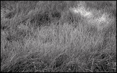
This is the grass in my front yard. My husband put patch treatments on yucky spots two weeks ago, so we can't mow it for another four weeks. Problem is, the weekend before that, he put some kind of Miracle Gro type thing on it, so now it's growing so fast, but we can't mow it. So he weed-whacks the whole yard, which is actually kinda funny. Last night, he did the whole outside of the lawn, but didn't finish the middle, which is still long. Well, he finished it tonight, so it's not long anymore, but it was when I snapped this photo. I like how long grass sways with the wind. It looks fluid-like to me.
About the photo: adjusted exposure, made black and white, added frame.
(You can see my runners-up here if you'd like.)
CC
Fluid Knowledge

As promised, here's the SOOC.

Fluid Breakfast
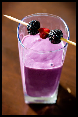 What do you think...which one would you have posted for the challenge? How would you have made the pictures more visually interesting? I took these this morning and wasn't going to post them because I've seen the ROCKIN' pictures coming in and was a bit intimidated, BUT, I figured that's no way to learn ;). So, let me have it. CC PLEASE. Thanks you guys!
Cleaning Up the Fluids...

Fluid Motion
FI-YAHHHH... (that's "fire" in a weird accent... don't tell me you don't know what I'm talking about). I used my Fireworks setting (sigh, I love that I have SETTINGS now) and holed myself in the bathroom all morning to get some crazy shots. Then I Boosted and Define/Sharpened it.
Fluid down the window
Fluid...both definitions
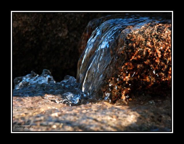
This was taken off of the rock waterfall we have in our backyard. It, to me anyway, shouts FLUID, both in the liquid form and movement. SOOC, just added border in Photoshop. CC welcome.
~Fluidity~
Wednesday, May 13, 2009
Fluid Beings
ISO 800, f 4.9 still working on perfecting the balance. Though I cant change the fstop my camera makes that auto I can change the ISO.

Fluid in Slow Motion
I was out and about looking for something that had to do with fluid and I happened to come across this waterfall a little ways out of town, I reduced my shutter speed to about 1/30 and got this really neat affect. Very happy with the way it turned out.
Smooth Movement
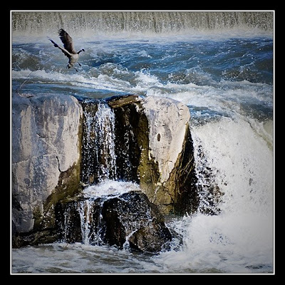
I was actually taking photos of the Falls for water (water= fluid) but the duck took off
from the side and flew into my path. I decided that was a better use of
fluid.
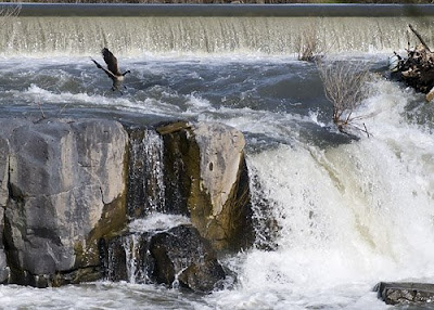
I did a lot to this photo in PS- well more than I normally do. There were some ugly sticks in the water that distracted from the duck and I didn't like how brown the water was so I changed those things. {CC}
ETA the Original
Swinging
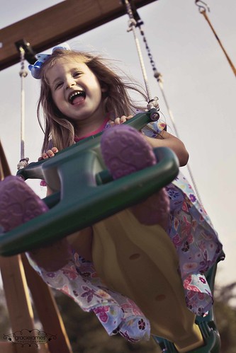 My sweet girl was fluidly swinging to and fro all evening long...
I got several shots of my family that I'm in love with this evening. Tony's leaving Monday to head back to Iraq and we won't be together again until December, so documenting every moment is very important right now. If you'd like to see more of the pictures from tonight, you can check them out on my family blog. :)
This picture: f/2.8, 1/2000, ISO 200
Literally!
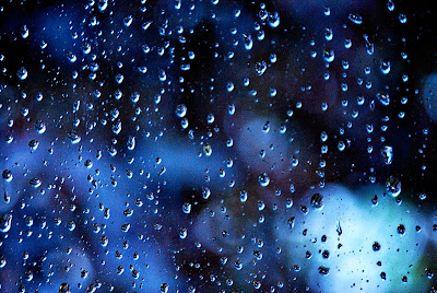
(f-5.6, ISO1600, Exposure 6 seconds)
So- as simple as this picture may seem, it was a real stretch for me. I actually pulled out all of my limited photography knowledge to pull it off and I realize it's still not perfect but I'm kinda proud none the less.
I used a tripod set up in my bathroom to take pictures of the droplets on the window. I needed to do it with with no flash so that I could still see the neat bokeh of the tree behind it. Then I had to use manual focus to get the droplets instead of the tree. Finally, I had to take the shot without shaking the camera since I couldn't find my remote. Wheew! Somehow I pulled it off, at least to some degree anyway.
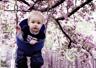 This was my original plan for the challenge- fluid motion of the swing. It was another tough one for me since I wanted to get the flowers of the tree and the lighting was terrible especially with a moving target. I still played around with it a bit on photoshop to give it a pinkish-purpleish hugh- just for fun. Sorry- I had to share!
Tuesday, May 12, 2009
Hello All You Talented People You!
I reside in beautiful Cheyenne, WY with my Air Force hubby, Joe, and my beautiful daughter, Alyssa (2).
Rachel told me I had to put a self portrait of myself on here. I went on to tell her that if I did that, that meant I would have to actually do my hair and makeup. Things I avoid at all costs these days! (just kidding....kind of.) So, here you are. This is more of a last minute, 10:42pm shot, focusing more on my camera than myself. Not that that is a bad thing. :)

Challenge : FLUID
I can't wait to see what this word means to you.
Be creative, let loose, see where this takes you, but most of all....HAVE FUN!
Happy snapping.
Be sure to post your entry by Thursday at midnight!
WINNERS: Change
Candace had the best angle this challenge with her front door wreath.
Best overall goes to Jen, with her desert sunset.
Jen also received the most combined votes.
Congratulations, ladies!
(Please scroll down to see M24 business and today's tutorial.)
Monday, May 11, 2009
Shooting Portraits Like a Pro

Taken Using the Rule of Thirds...

2) The "Sun Over Your Shoulder" Rule is Bogus.
You might have heard of this rule which says that you should always have the sun over your shoulder, or behind you so that the subjects faces are always lit. This, however, is pretty much the worst thing you can do. It pretty much guarantees that they'll be squinting and this is the last thing we want. Right? Right. It also causes them to have harsh, direct light bolting right down onto them. Instead, he says to try to keep the sun behind them, so that there's a flattering rim of light around them. Then you can use a tiny amount of flash to put just enough light on their faces to help compliment the natural light that's around them.
Also (this is totally me, NOT Scott Kelby), if you shoot with the sun behind your subject, you can catch one of my very favorite things.. sunflare!!!


3)Shoot Profile Shots in Horizontal
The reason you never want to shoot a profile shot in vertical is because they look boxed in and this tends to be uncomfortable to the viewer.
Here's that adorable little boy again. I don't know who he belongs to, but he should totally be a model for Gerber... ;)
See how this just looks wrong, but still... incredibly cute? ;) You just don't know who or what he's looking at. It looks like he's looking at the walls of a box.

When you shoot a profile shot in horizontal, it gives the subject more breathing room and they just look more comfortable within the frame... And... just in case you're curious about what that little bundle of sweetness is looking at... it's my dad.
4) Trendy Composition Tip
Turning your camera at an angle is a very popular technique right now. I love to do it. I was hesitant to post the picture below, because I was thinking.. hmm.. I may be breaking the number one rule in this one (too much headroom), but I think I just did pass with getting her eyes into the top third. ;)
Since most portraits are taken in either horizontal or vertical, doing something different like angling is always fun and... different!! :)

5) Cropping off the Top of Their Head
This is going a step farther than not leaving too much room above your subject's head. This is a very popular pro technique that fills your frame with your subject's head. Kelby says that although it's perfectly fine to cut off the top of the subject's head, side of the arms, shoulders, hair, etc., you should never cut off their chin. People are used to seeing shots where the top is cut off, but the chin being cut off is a very uncomfortable composition.
And I had to squeeze in a picture of my sweet girl... her brother's been featured five times already. Gotta give a girl some exposure...
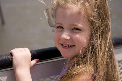
And here's my best friend and fellow photog, Amy, again... isn't she so beautiful?

6) Tip for Posing Group Portraits
The next time you go to pose a group of people for a portrait, instead of lining them up, try having them gather around and object or on a couch or chair. You'll find that they'll naturally arrange themselves around it or on it.
Also, for a more compelling group shot, put your subjects in a tight pyramid shape. Try to make sure they're all touching... arms around each other... heads really close together. It gives the shot a more fun-loving, casual look, and also provides a sense of energy and fun to the shot.
7) When Using Window Light
Positioning the Subject: The most beautiful light for portraits is the window light from a north facing window. The window acts as a diffuser and the larger the window, the more soft and diffuse the light is. You should position your subject with their shoulder facing the window... so that the light comes across them and creates soft shadows on the far side of their face.
Where You Should Shoot From: You want to be pretty much up against the window, shooting at a slight angle back towards your subject. Your subject should be about 6 feet or so away from the window.
Okay, this is where I'm going to end this tutorial. I feel like it's already gotten a bit long and drawn out. Sorry if I've bored you to death. Scott Kelby offers up many more suggestions in the book on how to shoot portraits like a pro, but these are the ones that really stuck out as being the most important to me.
And for the sake of not plagiarizing...
The Digital Photography Book Volume 2, Kelby, Scott, Peachpit Press, December 2007. Chapter Three. Pages 71-100.
All Images were taken by me. :)
Mission 24 business
Bet you thought I wasn't going to be showing up again today! It certainly took me long enough to get back on here. :)
Just a few things to note:
This week we are going to try to switch up the voting again. I would like to see how it goes just having people pick their ONE TOP PICTURE overall. Then we will have a second place winner.
We will try this out for a week or two and see how it fits. :)
We have also kind of drifted towards a change with the challenges, in regard to who posts them and what their role is. SO, PAY ATTENTION HERE! :) When you are asked to post the word, please go ahead and do so. But I also ask that for consistency, you also put up the voting post the day after the deadline. Janelle will continue to tally the votes and post the winners, so that's covered. :)
Now in regards to posting a word: If you didn't know before, now you will! You can PREPOST your word.
It's simple. Start your post like normal. When you have added what you want, you simply click on the button POST OPTIONS in the bottom left hand right below this box. That will give you several options for comments and backlinks...don't even worry about that. Just move your eyeballs over to the right side where it says POST DATE AND TIME. Put in the DATE you want it posted and the time. DON'T FORGET THE AM/PM FACTOR. AND, when you post, if you could have it post pretty early in the morning, so the East coast folks can see it early their time, that would be great! :)
NOW, also along the lines of PREPOSTING, I am going to have you each do me a HUGE favor! After I started getting all the submissions for the featured photographer, I realized how totally overwhelmed I would be if I were trying to save everyone's pictures and add them myself. SOOOO, If you each will go into blogger, add your pictures (DON'T FORGET YOUR SELF PORTRAIT!) and your questionaire, and then PREPOST IT. MAKE SURE TO Put a later date and time so it doesn't post right away!!!
If you all will use the same post date for the featured photographer stuff, that would be great. That way I can go in and change them to the right scheduled dates and it will be a surprise when your name comes up! :)
PLEASE USE THE DATE 9/09/09
Pretty easy to remember, right???
Don't care what time you put. Just please make sure the date is in the future--and preferably the 9/9/09 date! :)
Whew...what else?
Just a little note of encouragement to those of you who may be feeling discouraged. I am so disheartened at how often I hear feedback from people saying that they feel like they aren't good enough or that they are trying but feeling like they aren't being noticed. Heck, I have felt discouraged too--there is some seriously tough competition around here lately, isn't there?? :) It's easy to look at how wonderful some people are doing and feel down about where we might be individually. But please, please know that others share your same thoughts. And please know that we are each on our own individual journey...and ultimately, you are most likely to be successful with not only photography, but LIFE, if you are living and doing for what makes you happy and what you feel pride in. Feedback is great, and it helps us to improve--if we choose to take the things people are saying and actually do something with that.
So, let's all step it up this week and maybe take note of some of those who seem to be lacking in comments who are consistant commenters on YOUR posts...maybe we can validate each other a little more, and give some more honest feedback so we can improve.
And honestly, if there is anything I can ever do to help make this a better group, I am all ears.
OH, AND ONE MORE THING!
WE NEED TO FIGURE OUT A DAY FOR OUR M24 GET TOGETHER IN UTAH! We picked the 20th of May for the Eastern Idaho one, (still need to figure out where!) but I WOULD LOVE to get the Utah one planned so we can mark our calendars.
What are your thoughts?? And who is going to come? And where should we have it?? Something hopefully pretty central...
Okay...I am off. Have a great night...
VOTING: Change
Let's see who you thought should win
BEST OVERALL:
Best angle:
Get your votes in, and I will be back a little bit later today with some Mission 24 business!
Happy Monday!
Sunday, May 10, 2009
Waiting for a change
Change
So as my daughter and I were taking pictures of what few flowers were in bloom, only a few iris, and Rhody's she made note that the bees could sure use a change in bloomed flowers.

Some Things Never Change
 (50 mm, f/1.4, 1 sec, ISO400)
 A Change of Scenery (and a little off balance)
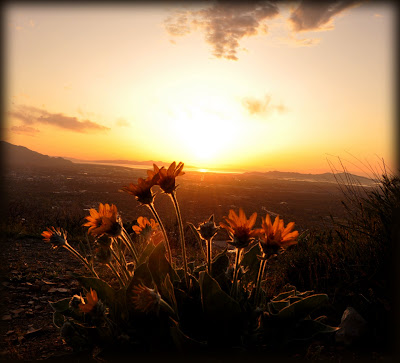
 20 mm, F 8, 1/500 s
18 mm, 160 sec, F 13
This one is a bit blurry (which I'm okay with since Rod is in motion). But it is so fun I had to include it. :)
CC
