Saturday, March 28, 2009
Simple: Flower

My crocuses are in bloom. I like this little flower because of its simplicity. It just sits there, not looking ostentatious, but making the world a little brighter.
About the photo: I used the macro setting on the camera, then used Picasa to edit the photo. I made it slightly soft focused, and then also used the "focal black and white" option to really make the flower pop. The editing wasn't very "simple", but the subject is.
CC
A Simple Author
One of my favorite Authors is Beverly Lewis, her books are all about the Amish, a plaine and Simple People. She usually writes the books in series so you can fall in love with the characters and follow along and learn about their Simple way of life.
And the winners are.....
That was an especially tough voting! Tallying was hard because it was VERY close!
The best take on the challenge went to Leanne with her jellybean picture (which was totally cool!) (if I counted right--correct me if I am wrong!)
The best overall was a tie between Lindy and Leanne, but since Leanne took the BEST take award, Lindy gets the Best overall picture for her awesome display of rust. :)
GREAT JOB everyone!
Simple Lighting
Simple beauty
Simpler Times
Just a Simple Puzzle
CHALLENGE: Simple
CHALLENGE: SIMPLE
Let's get those creative minds thinking...this should be a really good one.
Friday, March 27, 2009
Let the voting begin!
So, as tough as this will be, let the voting begin!
Be sure to just put in your comment:
BEST TAKE ON THE CHALLENGE:____________
BEST OVERALL PICTURE:_______________
And then you can add any additional comments of shoutouts. :)
Again, I can't thank all of you ENOUGH for sharing your beautiful art so freely. I am in awe at how much everyone is improving, and how quickly!
VOTING CLOSES TONIGHT AT MIDNIGHT. Winners announced tomorrow morning. :)
Happy FRIDAY.
Thursday, March 26, 2009
redo Abstract.
Abstract View
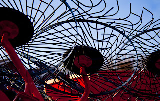
350 with F 8
Canon Rebel XTI
CC
On Angel's Wings
Abstract Circles
This is what I came up with, Abstract Circles

Taken in shutter priority mode with a shutter speed of 1/2.5, iso:200, F36. This shot is also SOOTC. Can any of you guess what this picture is of?
CC
Abstract Twilight Dessert
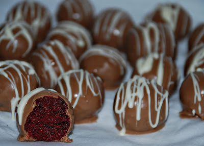 Don't laugh! This is kinda cheesy.
I am having a Twilight party at my house tonight to celebrate the movie release on DVD. (That's not the part that might make you laugh) For dessert I am serving, "Bella Bites"- he he.
They are an "ABSTRACT" representation of the film. The pure white represents Bella, young and innocent. The darker Chocolate is the dark side of Edward. And the Blood Red Center (red velvet cake)... what do you think?
Pretty abstract right? I know it's a bit of a stretch but I've been wanting to try these and I thought my party would be the perfect chance-I just needed to figure out how to tie them in. See, Cheesy right? I told ya so!
FOUNTAIN
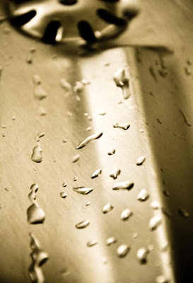 I have to thank Mindy again for suggesting this challenge. I had so much fun with it! It was so hard to choose what to take pictures of--but I decided on a drinking fountain at our church when I was there last night for a meeting.
A Big Pile
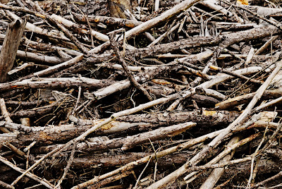 Well, I was really challenged by the word ABSTRACT. So, I just put the camera in the car and started driving around, when I happened upon a pile of wood. I almost drove right past it, but at the last second, I swerved off the road, parked on the shoulder and jumped out. Thank goodness noone else was around and no other cars happened by.
 This is about as abstract as I get. Hope it's acceptable.
I took this with my wide angle lens. f/6.3, 1/100, ISO 100. In ps, I sharpened and saturated the colors.
Abstract

(Taken with a Nikon D-40, automatic setting, slightly cropped.) CC welcome.
Ok, so this next one isn't my official entry, but I loved this picture so much that I couldn't help but share it!

Something Fun to make Abstract
Abstract: Literally

I wanted to do something a little nerdier for this challenge, and I knew that I could. My husband is a statistician. This is a photo of a derivation he did for a homework assignment in grad school. Initially, I wanted to post it and say, "this is a picture of...literally...an abstract." But he said it's not actually an abstract. It's a derivation. Well, a proof, he clarified. But it uses mathematical abstraction to provide a mathematical relationship between ordinal categorical variables.
Whatever that means.
About the photo: it is completely unedited. I did nothing to it except load it from the camera to the computer. I tried a couple of things, but it just looked best in its original form.
Water Everywhere
Abstract: Carly Carlson
Abstract Flowers
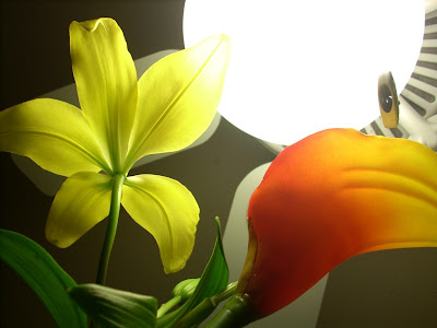
I had a fun time deciding what subject to use for this challenge. I started taking close-ups of the carved details of my Turkish jewelry box. But I couldn't really come up with a shot I really liked. So I moved on to close-ups of a box of cracked wheat with a measuring cup. I got some interesting shots, but there was no color! I've been doing bland shots lately so that didn't really work for me.
Then later while I was working on something completely different, I happened to look over at the dining room. Jeff had put our centerpiece on top of the cabinet so the kids wouldn't get to it, and the way it was sitting made it look like the flowers were opening up to face the light of the ceiling fan. I loved the way it looked and immediately stopped what I was doing, climbed up on a chair, and started snapping away!
ISO 50, camera set to overexpose by +0.3 so the flowers wouldn't be drowned out by the light. I'm particularly proud of the fact that I didn't enhance it on the computer at all - this is exactly as I took it on the camera.
CC
Abstract Roots

Wednesday, March 25, 2009
Abstract
Is this Abstract?
Hello Again!!!
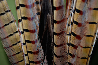 This subject was hard for me, but it forced me to be a bit more creative. I wish I knew how to change the borders and background colors...any ideas? Or better yet I wish there was no background and all subject, dang wish I would have thought of that earlier! I also really debated whether or not to post the b & w version.
Stripes of Something
Mission Abstract

Super kid

I hope this is abstract enough, it about as abstract I know how to do. A big shout out to my mom April R for letting me use her camera and her studio WOOT WOOT! I don't know what the settings were, maybe my mom can put it in the comments.
In photoshop I lightened it up, turned it black and white then used the history brush on his cape. I added some saturation and darkened the edges a bit.
Abstract
This morning at about 8 am, I went outside to our neighbor's burned down house. They have a really old, rusty horse trailer next to our garage, which is great photo fodder, especially for the macro that I seem to have a love affair with. I love macro because it makes every shot abstract and interesting. Looking at this photo, you wouldn't see old, rusted horse trailer...ok, you'd see old and rusted, but not horse trailer. If you were to zoom out and take a photo of the entire trailer, it'd just be, well, boring. They have these random chains hanging from the side and this leaf was just sitting balanced like that. CC
CHALLENGE: Abstract
So, the challenge: ABSTRACT
You have until midnight on Thursday night to submit these. Voting will be Friday!
Tuesday, March 24, 2009
And the winners are.....
When you vote, if you could please just write:
Best overall: _______ (fill in with one name)
Best take on the challenge: __________
and below you can write your shoutouts and praise.
It's tough to count when there are so many names and people don't decide on ONE, or don't label which category someone should win. Keeping it simple will be SO much easier!
Thanks...
Now, onto the winners. DRUMROLL....
Best overall picture was TERI
Best Take on the Challenge was MINDY
But I have to give an honorary mention to AprilF, who got TONS of votes (just not in the same categories)
You all did an extraordinary job this week! I was SO impressed! It feels like so many of you are really stepping it up and doing amazing things with those cameras. I love that inspiration.
I had been going to create a separate blog, and actually even began the process this morning. But I am actually leaning towards not doing that. It just adds an extra step of work, that I don't know if I can to pick up right now. A thought I had was to go back into the winners posts and add the category they won under their picture so it will show up on the sidebar and you can still click through easily to see the winning pictures.
Anyone else have a better idea? Or do you like the idea of a separate blog for the winning pictures? And if so, is there someone who wants to manage that?
CONGRATS TO EVERYONE! You all did an awesome job! I am so excited to see what the next challenge brings!
Monday, March 23, 2009
Let's VOTE!
Best all around picture
Best take on the Challenge
WILL CLOSE THE VOTING ON MONDAY AT MIDNIGHT. So this leaves only a one day voting period (I don't want to drag things on and on into the next challenge)
Leave a comment to submit who YOU think should take the title this week! :)
Feature
I got off work this morning at 7 am and walked outside to see a b-e-a-u-tiful day, complete with clear blue skies. I couldn't resist. I sped home, grabbed my camera and my dog, and drove up to our Oregon Trail Interpretive Center, which is definitely a huge "feature" of our town. The Oregon Trail runs right through our valley, and the interpretive center sits up on a hill and has trails down to the wagon ruts. I admit, I've been to the center at least 20 times in my life but have never walked to the ruts. There's also a "wagon circle" sitting on the top of the hill. One of them was painted these great colors, and I couldn't resist laying down on the ground to play with all kinds of angles. With this one, I used PW's "Fresh & Colorful" and "Boost".
Sunday, March 22, 2009
Feature This....

Sweet
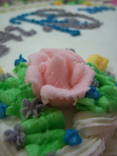
Went to a church birthday party the other night and played around with my camera. I'm going to be inherting my hubby's canon eos 30d soon and then I'll get to learn and experiment a bit more. This was taken with my little Kodak point and shoot. I'm getting better with my depth of field. The woman who decorated the cake did a fabulous job with making the cake features... (is that too lame of a tie-in?--I have to admit that I haven't been super inspired in general)
Nightly Feature

Spring Baby
Feature Entertainment
The shiny red feature
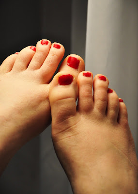 I had so many ideas for this one, but most of them involved little people who were in bed when I realized I hadn't taken the picture yet. :)
So after lots of thinking, I realized that one thing I absolutely love is painting my toe nails. Even on the worst of days, the shiny red feature on my toes puts a little spring in my step.
Support and Feature
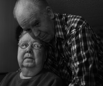
32 mm, 1/60 sec, F/4
Even though I made a lot of mistakes with this photo (the reflection in the glass, cutting off my Grandpa's head, strange object growing out of my Grandma's head), I love this photo. The emotion in my grandparents' eyes say it all. After (almost) 60 years, they support each other completely. My Grandpa is currently taking care of my Grandma, who has been ill for a long time. They have also always supported me.
Tiny features

42 mm, 1/100 sec, F/4.5
Daffoldils
Feature: Favorite feature in the house
 When we were house-hunting, the previous owners of the house we ended up buying were still living in it, furniture and all. I fell in love with the house. It was lived in, but it was full of life with all the colors on the walls. Every room was a different color. I grew up in a home with primarily white walls, so I'm not accustomed to bright colors. After we made our offer and flew back to the state we were living in at the time, I got really excited about moving in. The more I looked at the photos of the dining room, the more I decided it would be the first room painted. My husband convinced me to wait at least six months before making any major changes. I'm so glad he did, because the dark red dining room is now my favorite feature in the house. I get so many compliments when people come over, and I just love the room now.
About the photo: Taken at night, lit only with incandescent bulbs in the room. I used flash, but cropped the photo so that the glare was out of it. I used a "warmify" feature to add even more to the red.
A Prominent Feature...
(I used a Nikon D-40, automatic setting, no flash, with natural overcast lighting, then slightly cropped it.)
Feature Presentation

"Light"
My Best Feature
But my feet, now them I have always loved!
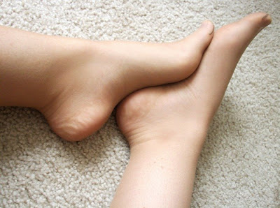
I took this picture after Church so I'm still wearing my nylons. I like the smoothing look they give. As with most of my pictures, I took this with point-and-shoot in natural window light. I lightly enhanced it by adjusting brightness and contrast.
Featuring Playtime

When we got home.... we made some! Way fun.
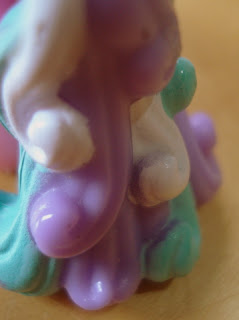
This nasty color is a combo between three separate and beautiful colors. Green, Yellow, and Purple. (This is what happens when a two year old decided to mix it up a bit)
Recipe here
**I know, this looks really gross, but it was something new to feature. **
