
easter always means new birth to me, and the warm, and flowers... i meant to upload this one!!! for the challenge, my flowers starting to pop. oops, sorry it didn't upload! here it is!


 When I think of black and white I think of something old but with a lot of character. That is what this church is old but the building has so much character. I took a lot of pictures of the whole church but liked this one of the door the best. At first I thought the palms were too much of a distraction but now I kind of like them.


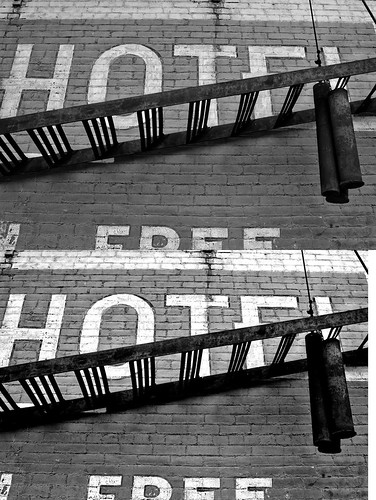
 I had a really hard time with this challenge. I wanted to take a picture of something that looks like it should be black and white, and I couldn't find anything I really liked. I went to work tonight and took my camera with me, snapping stuff while I was out (even sitting at a stoplight through the front windshield). There was a meat truck sitting in the parking lot at my work, and I snapped a quick picture on the way in the door. A friendly 60-some-odd-year-old man was coming out the door at the time, and saw me take the picture. He said, "I can set you right up, you don't need to take a picture!" I actually ended up with several shots I liked (once in black and white), but my husband picked this one out of my top two.

 The SOOC version of this was actually fairly happy. Blue sky. New spring colors just starting to peek out. Then I turned it B&W and got a totally different feel. Kinda scary and foreboding right?


 I really didn't like putting this picture in B&W. It looked so good in color. But I love B&W. It calms everything down! So... what do you think of my angel wings?
 (D70, ISO 500, 1/60 sec, f13.0, 120mm)
 I found this bridge last summer while on a bike ride. As soon as I saw the challenge I knew this was the pic I wanted to take. The one good thing about the storm that blew in this evening is the clouds really added texture to the sky.
 1/1600, f 5.6, ISO 200, 11mm

 I love black and white for the fact that you can take a simple picture put it in B&W and it gives it depth and even life, some times. When I thought of this challenge I instantly thought of the simplicity of music in it's appearance, just the black and white notes across a page but how complex music really is, kind of like Photography.
 Now, because I simply jumped right in to the challenges a week ago and never properly introduced myself I'll post a self-portrait and give some quick info.
 I have loved this sign in our backyard ever since we moved in. As I was looking for inspiration, it popped out at me. I love it's rustic look.

 Still no computer... still no photoshop... still one sad duck. :( (Luckily my camera can convert to black and white IN camera!)
 (I will do a seperate post for my B&W challange pic, just give me a couple of hours :)

 Here is my cute nephew in the motion of eating. I loved the motion of the cheese sliding off the pizza. SOOC.


