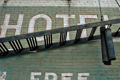
First, here's the pre-black & white photo opened in Photoshop. Ooooh, aaaah. Being the Pioneer Woman Action addict that I am, I generally run her Define & Sharpen action, toning down the opacity as needed. I'm also currently in love with Boutwell Magic Glasses by Totally Rad Actions...I sat here staring into space for a good 15 seconds (sorry, short attention span) attempting to come up with a fitting metaphor to explain to you my love of this action, but words fail.
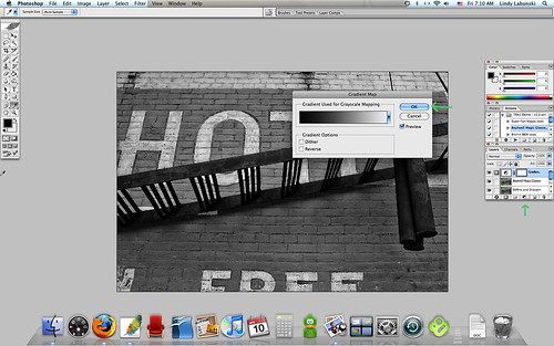
Next you will notice the palettes on the far right of the screen. At the very bottom is the tiny circle cut in half, black on one half, white on the other. Click on that and select "gradiant map" out of the menu that drops down. When the little gradient map screen thingy pops up, push ok. This will change your color photo to black & white.
Unfortunately, it's pretty dull. More "Study of Shades of Grey" than black & white. To fix that, go up to your Layer menu at the top of your Photoshop screen. Under that menu, select "New Adjustment Layer". A second menu will pop out to the right, from which you will choose "Level". Another small screen will pop up giving you the opportunity to name that layer...don't bother, just push ok.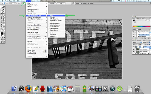
Next, your level adjustment screen will pop up. Here's where it gets a bit more complicated. See the graph? Good. See the three little triangles under the graph? Great. Notice that there is one triangle to the far left, one in the center, and one to the far right? Wonderful. The one on the left is going to control your blacks, the one on the right, your whites.
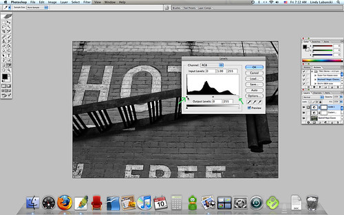
Before clicking on the far left triangle, push and hold your Option key (alt if you're on a PC), then click on the left triangle and start dragging it slowly to the right. This will white out your photo, but that's ok, don't panic. You will start seeing blacks appear; keep dragging until you are happy with how black your blacks are. Let go of your mouse and see how the blacks in your photo have changed. If you want to, you can un-select the "Preview" option in order to see the original b&w.

Now repeat this process, only clicking on the right triangle and dragging it left. It will black out your photo and you will start seeing whites appear. You can continue adjusting both the blacks and the whites until you're happy with the balance. This is my final product.

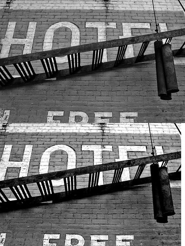
See? True blacks + true whites = a photo that really pops! Here's the original B&W next to the edited B&W. Yay no more muddiness!
Mucho thanks to my girl Carly Carlson, who first introduced me to adjustment layers. They have changed my life! (Ok, just my photos, but still.)
Hope this helps!
PS. Rachel, sorry about the shots getting cut off on the right, but if I go any smaller, none of the detail will be recognizable. Maybe if we were to go to a Minima Stretch template (it wouldn't mess anything about the blog up), larger images would fit better. Because larger images are happy! :)
PS. Rachel, sorry about the shots getting cut off on the right, but if I go any smaller, none of the detail will be recognizable. Maybe if we were to go to a Minima Stretch template (it wouldn't mess anything about the blog up), larger images would fit better. Because larger images are happy! :)


7 comments:
OOOOH!!! WOW! This was PERFECT! Thanks for doing the friday feature today! You did a super job!
I can't wait to start experimenting more with adjustment layers! The difference in the before and after shots are amazing.
Ok, not only was this tutorial REALLY easy to follow (for us "Edit-tards" out here) but SOOO much fun to read... humor, love it! And the picture-- wow! I thought to myself, "this original ain't too shabby"... but now seeing the process of perking this baby up... HELLO! The new and improved picture is SOO much better... yowza!! Thanks again!!!
Okay Lindy--change whatever you need! :) I will add you as an admin so you can change away! :)
I hope that looks Ok to you Rachel! I made sure to copy down the colors and fonts for everything, so it should all be the same except now stretched!
yep, looks super! :)Seriously you could change whatever. I am not set on anything! :)
Great job, Lindy!! I was very excited that you did your friday feature on this. Thanks!
Post a Comment