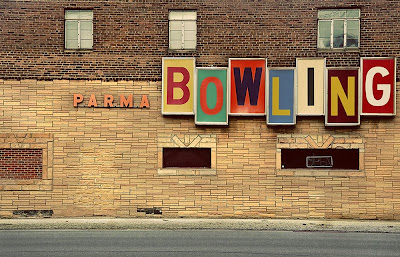
> Okay, I have no idea what I am doing wrong, but this looks way different than it did when I finished it in photoshop--I even saved for the web--I thought.
I love driving by this sign--it always takes me back in time. :) I love the feel of it...even if my picture doesn't look right. :)
(DOUBLE CLICK ON IT TO SEE IT BIGGER...although it still isn't as crisp as it was when I edited it)
ISO 200, F8, 1/60 second, ran a boost and seventies preset in Photoshop and changed accordingly to my taste.
CC...please...


17 comments:
Ohhhhh Rachael......so dang cute!! I love it!!!!!
I cant think of anything Id do differently....which photoshop are you using?
CS4...But I am honestly not really familiar with it because I usually work in Lightroom--trying to get myself into CS4...AND AM STRUGGLING! :)
Rachel, there is nothing wrong with your picture...I love the old vintage letters that spell bowling..so cute. Reminds me of my childhood because my dad was a bowler on a league and me spent many evenings at the bowling alley.
I love the great lettering. You're right- very vintage. The only thing I can think to change is to cut out the asphalt. It's just a little more modern I think and takes away from the great vintage look. You could try some other angles too- just to give it a different spin.
I tried lots of different angles...the only way to really get another angle that would make it readable, is to stand in the middle of a very busy street. :) I had to click shots between cars--it was quite funny.
I really LIKE different angles--and looking beyond, but for this shot, I think I actually liked it straight on the best. (that was after like, 100 shots) LOL...
It's modern vintage! I love the sign. The colors and the angles make it modern funky, but the lighting and the editing makes it look vintage.
I love this! The 70's lettering is so cool!
I agree with Teryn in that the only thing I'd change, if anything, was maybe to crop out the asphalt.
I think you did a great job, though!
I struggle with pics like this all the time that have an edge of street or something in it....but I think honestly that it shows the demensions more when you include the street in it....just my opinion, I love it
I like it! and is that parma like parma idaho???? i almost made my logo like that! i am such a rockabilly! fun fun! good job
iloveitiloveitiloveitiloveit!!!!!!
(me, squealing, jumping up and down)
it's even BETTER when i clicked on the photo... it's beautiful! (and it gave me a good idea for a project i wanna do... when the cows come home!)
even the brick is VERY cool with the texture and details... Go Rach Go!
haha Lindy Lue--no, not Parma Idaho...Parma, OHIO...but ironically enough I have an uncle who lives in Parma, Idaho. :) What are the chances??
And just an FYI...I tried it out cropping the street out and it looked worse...the street may add a bit of modern, but it really adds to the picture--I don't know why, just something about it. I appreciate the tip though! I am always up for trying something different and improving...this was a tough one with that street and curb and it was nice to get some feedback...
I honestly can't think of any cc. I think its an awesome shot. The letters actually remind me of scrapbooking for some reason, hehe. I love the character of the bricks.
Rachel H that is funny your uncle lives there lol!
I think I would have just zoomed to get just the logo and less building but the bricks do add some different colors to make the logo stand out so either way it is a great shot nice job!
Rachel, this is one of the "feels" I wanted to capture with this word, and you did it! I LOVE this picture... it totally rocks! I'm laughing picturing you dodging cars to take the picture... anything for a good picture, right? ;)
I LOVE this for vintage! Very unique take on the challenge. I really like how much of the building you chose to show and the asphalt doesn't bother me. Even though this was a vintage challenge I think this would look good with the colors a little more vibrant (it might be a tad underexposed as is) - and maybe even some texture. If it were my photo I might also clone out the red brick part on the lower left of the picture as my eye is drawn there a little bit. Great job Rachel!
That was me - sorry- I forgot my hubby was the last to log on.
Post a Comment