f4.8 1/640 iso200 no flash
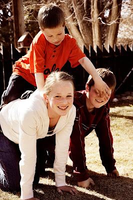
When I thought of support, I couldn't stop thinking of a pyramid, so I made my kids play around when they got home from school. My silly 7 year old kept poking the older 2 in the nose and eyes, and, like the good siblings they are, they kept supporting him (even though it made them laugh!){cc}
f5.6 1/10 iso100 no flash
I also thought I'd post a picture of my "camera support", for Erin... now you can see how I taped the front, to keep it nice, and tabbed it, so I can find things quickly. :) Yup, like I said, I'm a nerd.


17 comments:
Now that is impressive!! I should have thought of doing that to my manual before it... well looks the way it does! I like your support photo!! your kids are cute!!
What a great idea!! Very creative and spontaneous shot!
And you are a nerd, huh? JK!! :) Love what you have done to your manual. Well loved, huh?>
I love the photo of your kids. I like the double entendre of the pyramid and the siblings. And I also like how the younger one is tormenting the older ones, because it makes all the smiles look natural.
That's a fun picture - great example of support. The only suggestion I would have given doesn't even count - I would have suggested that the little one not have his hands in his brother's face! But there are some things you just can't control. :-)
Such a cute picture of your kids!! I love that they are still playful and having fun.. it makes it even more FUN to look at! And way to go on the manual.... ahhhh... one day i'll have a d90 and I'll read it religiously!!
Love that pyramid picture. How fun and the colors are great
I took a BUNCH of pictures, and there were some that didn't have a hand in the face, but this one made me giggle, so I went with it. With my kids, perfection in a picture would be a lie. ;)
Katy, I LoVe my D90. I hope you get one someday!! :)
Thanks for the comments, everyone!
Awesome pictures. I love the pyramid idea
nice pictures. I even like the camera book with the table. You got some detail of the table in there which I liked as well.
That is a good idea I might just have to borrow that and tab mine as well. but first I have to read it. LOL
I actually like having the boy's fingers in the other face. I think it shows that we can choose to support people even when they aren't being nice.
I need to find my manual. That may not happen for a couple of years because we're moving...
Love this idea! I also like the hand in the boys face- shows the playfulness. The crop on your daughter is a little distracting I wish there was a little more- and there's a slight finger chop.
Cute kids
I love the pictures of the kids. Quick question...what do you do to make your pictures so vintage looking?
Thanks!
Amanda, I'm a vintage-retro loving girl, that's for sure! :) I usually use pioneer woman's actions, but I mess around with them and mix them up a lot, so it's hard to give the "formula". If you have photoshop, you can download her actions for free (yay!). Two that I use a lot when I really want the vintage look are the "vintage" action (big surprise there) and the 70s action. I usually lower the opacity, though, so it's not full out. Good luck!
Thanks, I visited her site to find out some tricks. I use Elements 6.0, so I can't download, but I did do some reading.
I love the pyramid- it looks very warm. Was that on purpose? Or did you add it with editing? Either way- I like it.
Teryn, the photo itself was very warm, and I added some in editing, too. :) Thanks!
Post a Comment