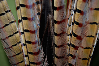
 This subject was hard for me, but it forced me to be a bit more creative. I wish I knew how to change the borders and background colors...any ideas? Or better yet I wish there was no background and all subject, dang wish I would have thought of that earlier! I also really debated whether or not to post the b & w version.
CC


10 comments:
I actually really like this as is! I like the colors and the texture is interesting. You could have cropped it a bit closer and had just the subject, but I don't find the background distracting either. Good job!
I love this picture! The textures and colors and patterns are great! (And I'm glad you're back!! :)
For abstract I like the colors! I think it is good and I agree with Mindy!
Awesome. I actually like the background and who it throws a bit of color in there but it is not too distracting of a color. I think it blends well.
I like it, but if you find it distracting, I'd crop it a little closer...but it's great anyway! Cool colors and neat texture!
I love the color version of this... to make it more abstract I agree to crop it in -- I'd love to see a really tight section. Great subject!
I really like this to! I love all the different patterns and texture. I think it would look Great b&W.
THIS IS SOOOO COOL! Melissa, you have "GOT IT: as far as talent goes! I love seeing your work and I hope you're back for good!
I love the angle of the feathers, and the colors, the background actually adds to it.
Love the textures and colors of the feathers, and love this picture!
Post a Comment